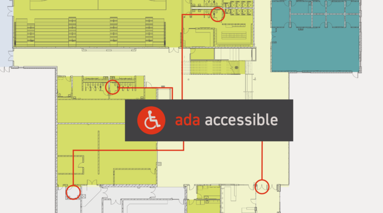
Part 3: Accessible Design in Action
Beyond Vision’s new VisABILITY Center is a case study in accessible design. Bray’s interior design team carefully selected materials and finishes to maximize the tactile response for the center’s low-vision and vision-impaired employees and visitors.
As part of the research process, Beyond Vision shared a pair of goggles with the interiors team that simulate vison impairment.
“We utilized these goggles as we built the finish palette to better understand how each material would be perceived,” said Shari Sandler, interior designer at Bray. “This tool was very helpful in not only selecting efficient materials, but also granting us a better understanding on the impact the space will have in the daily lives of the employees.”
Let’s look at four key accessible design principles used at the VisABILITY Center and some examples of each.
Contrast
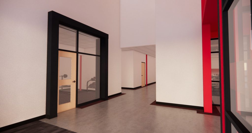
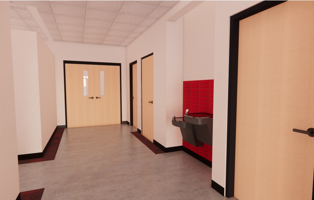
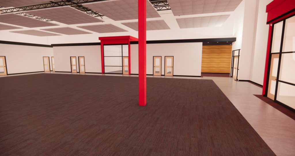
Principle: Bright, contrasting colors are easiest to see, and they help vision-impaired individuals distinguish surfaces.
Examples include:
- Black trim along white walls
- Dark-colored door frames around light-colored door panels
- Black laminate insets at countertop edges
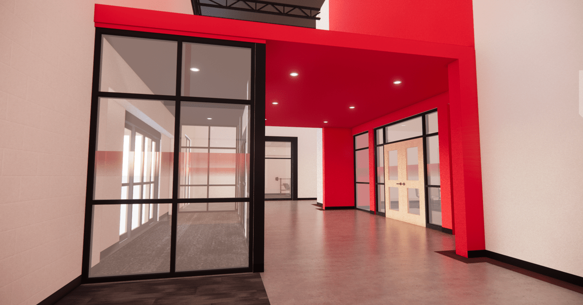
- A red gradient film at eye level to flag glass doors, windows, and dividers
- Black cabinets and light countertops against a red-tile wall in the kitchen
The designers chose the black, red, and white colors because it reflects Beyond Vision’s branding, so the scheme was an opportunity to personalize the space. The colors also call attention to various amenities throughout the building. For example, employees and visitors can locate the drinking fountains with the help of the bright red tile backsplash behind them.
Texture
Principle: Changes in floor texture aid navigation.
Hallways at the VisABILITY Center are primarily polished concrete, but they include a one-foot-wide plank of red-speckled carpeting along the perimeter of walls.
Dubbed the “shoreline,” the carpeting is important because:
- Many individuals are traveling with a cane, feeling and listening for textural differences as they slide and tap the cane
- It acts like a railing to guide users through the entry, corridors, and office area
- For low-vision individuals, the red speckling in the carpeting provides visual contrast to the light-gray color of the concrete
Sound
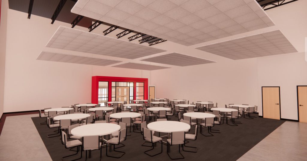
Principle: Sound helps blind and low-vision individuals orient themselves in space.
The high ceilings of the VisABILITY Center make it difficult to control ambient noise, which can confuse users as they navigate the space.
To reconcile this, the design team added:
- Canopies of acoustic ceiling tiles over doorways and rooms to reflect sound back to the users
- Acoustic insulation between canopies and ceilings to dampen stray sounds
- A digital sound system to control ambient noises
Lighting
Principle: Control light sources to minimize glare.
The design team specified:
- Ambient lighting to reduce the likelihood of glare off reflective surfaces
- Task lighting to illuminate work areas, including undermounted lighting on all cabinetry
- Flat paint finishes to help reduce glare and reflection
- Plentiful windows throughout the building to bring natural light to the core of the open office area and manufacturing space
Heading Towards the Ribbon Cutting
The VisABILITY Center is an elegant and contemporary corporate environment that will work for all its users regardless of their sightedness.
“There was a lot to learn with this project,” says Stephanie Vierling, interior design manager and associate at Bray. “We’re so appreciative for the close collaborations with the Beyond Vision staff and Chris Downey to make this space come to life. It’s going to be a great one for all of its users.”
The project is targeted for completion in the summer of 2022. Stay tuned to Bray’s news page as we get ready to celebrate the building’s opening with Beyond Vision.
In case you missed it:
Read Part 1: On a Mission for Accessible Spaces
Read Part 2: Collaborating with Chris Downey
Watch Low-cost, High-impact Accessible Design Solutions
Featured image, top: A red gradient film applied at eye level on glass doors, windows, and dividers will flag these surfaces for low-vision employees and visitors.